Sometimes you need pages to look a little more permanent. For those all you need to do is check the page box in the bottom right of the post and you'll get a nice blank slate to work with. We removed the comments, tags, and author info to keep things clean. You still have all the advanced functionality, it's just less cluttered.
Building A Simple Ghost Page

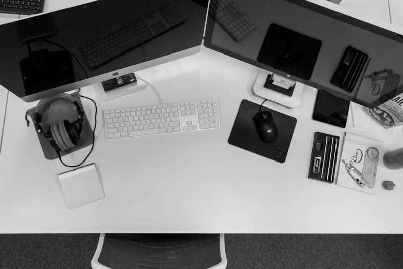
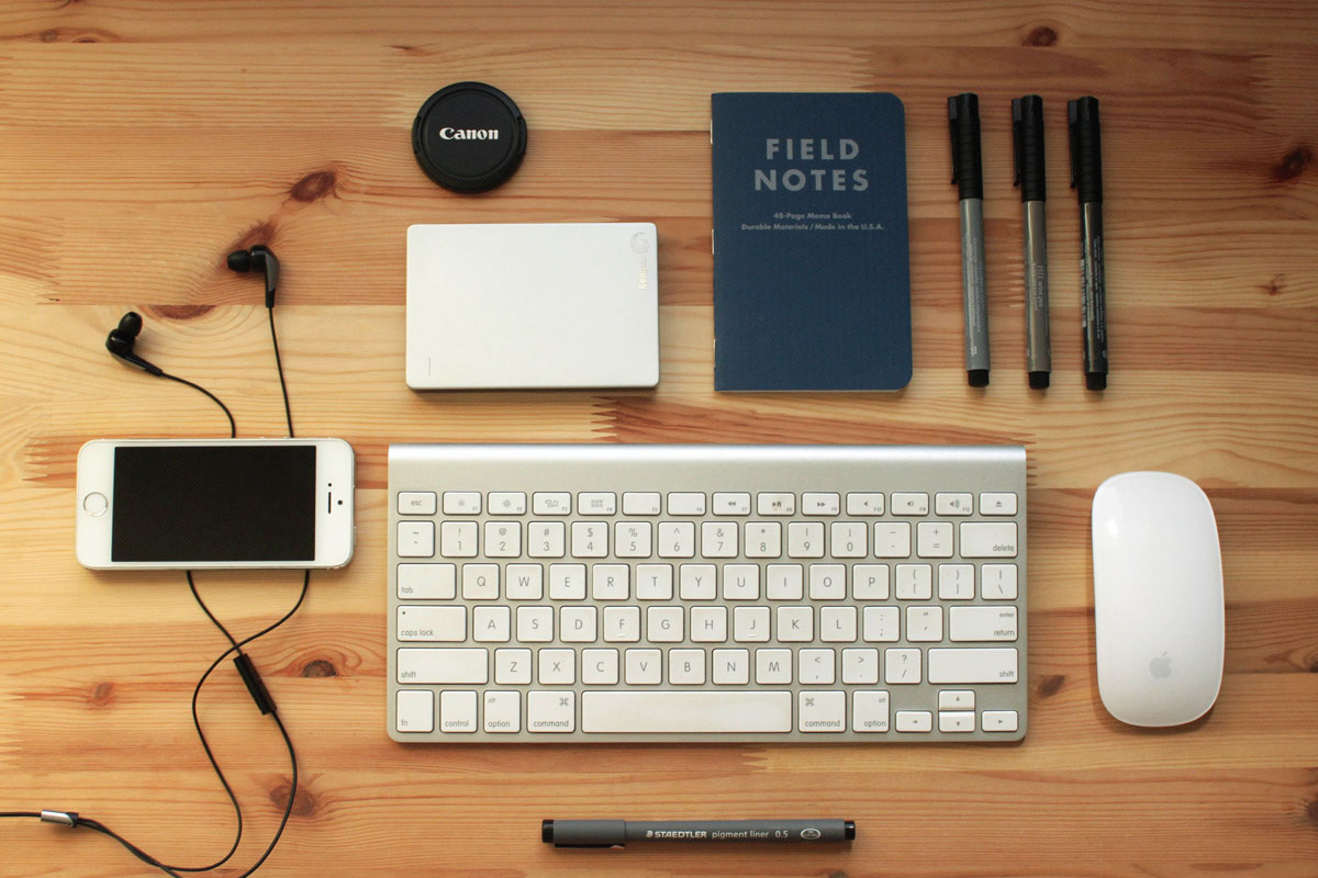
On an "About Us" business page for example you might want to start out with some classy office stock photography. Lets drop one of those in here, align it right, and see how it looks. ...ah yes - that will do just fine. Now visitors know we're in the "business" business. But how are these customers going to find us? We should probably include a nice flexible Google Map.
Then maybe we could include a little centered text below to reinforce exactly what we do. Keep in mind that any of the UIKit library can be used across your content, that means tabs, overlays, modals, etc. I think this page could use a bold "Call to Action" button to seal the deal.
What About Pictures?